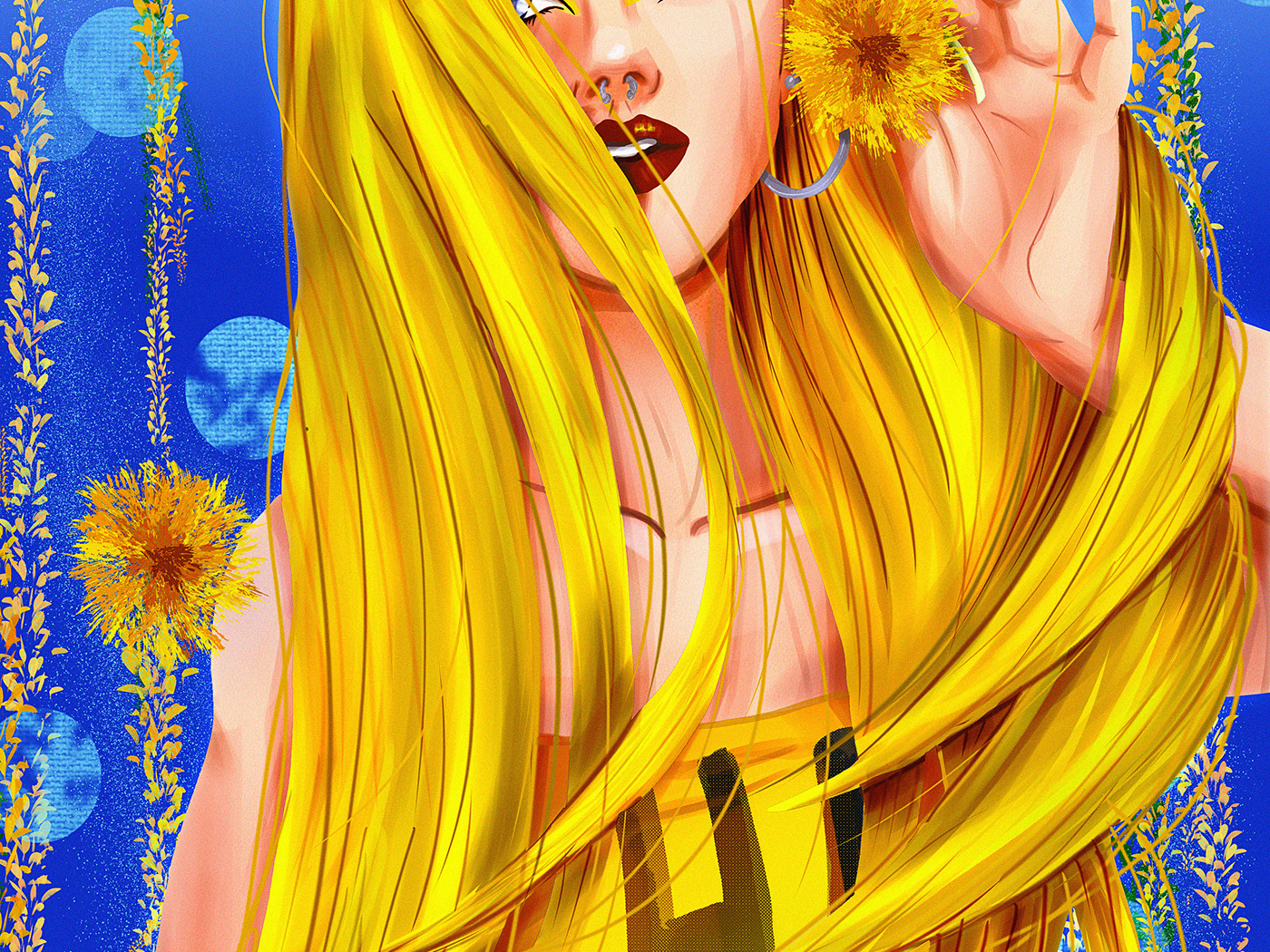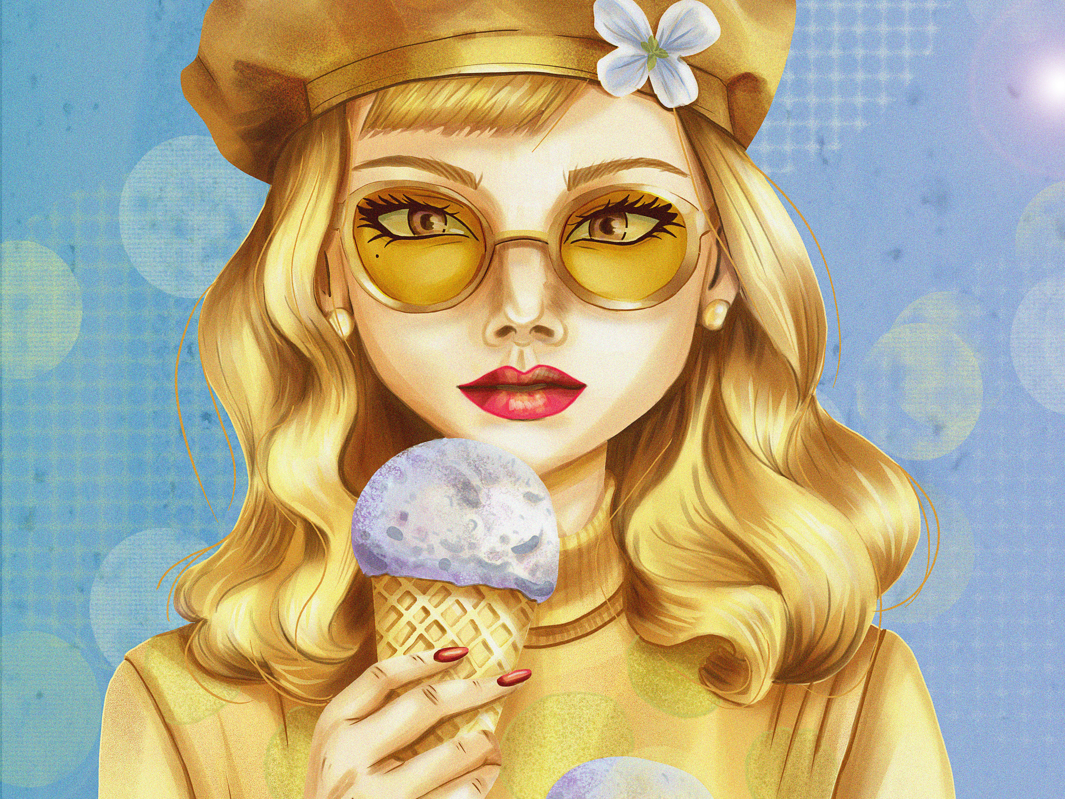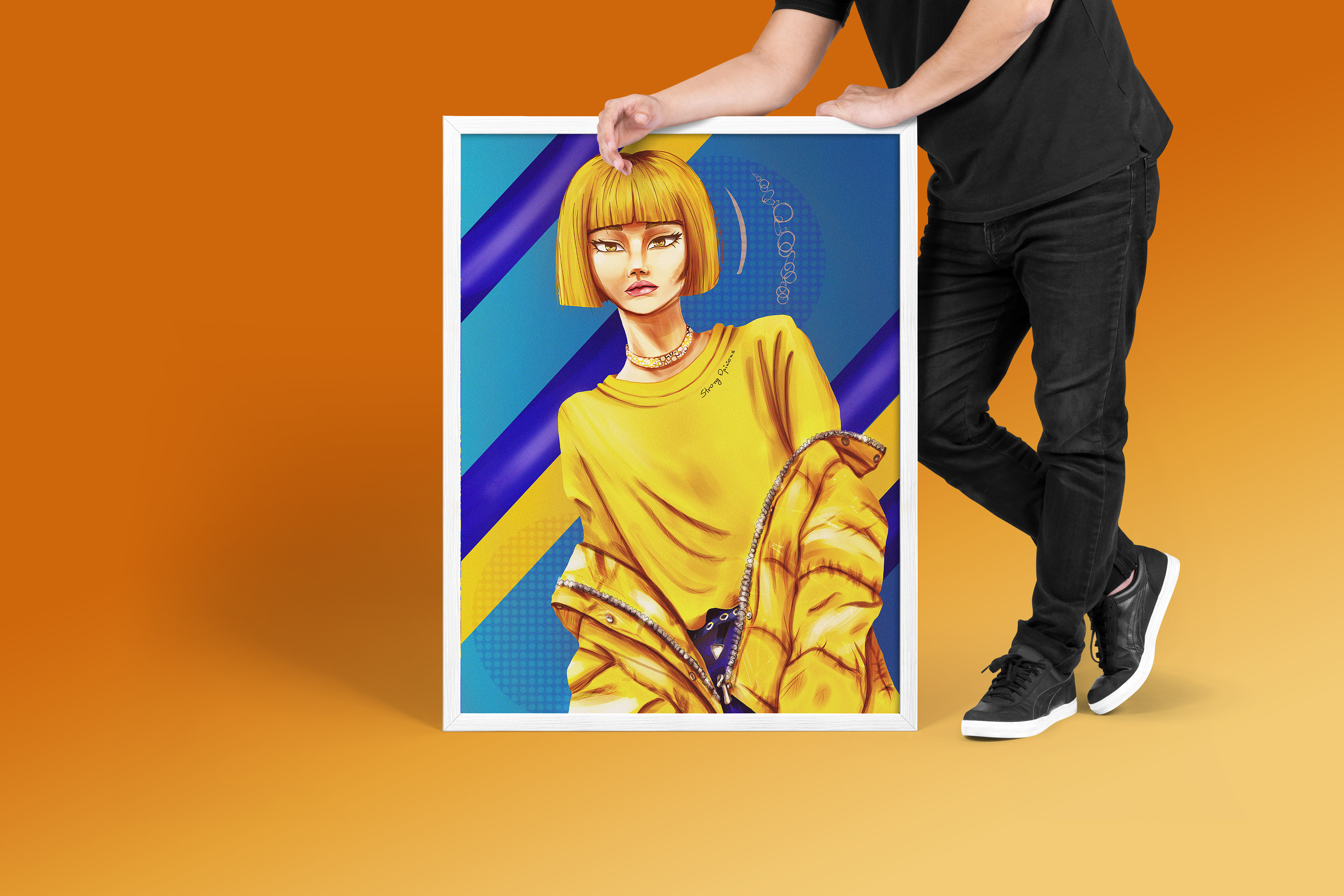
Portrait illustration: Ochre
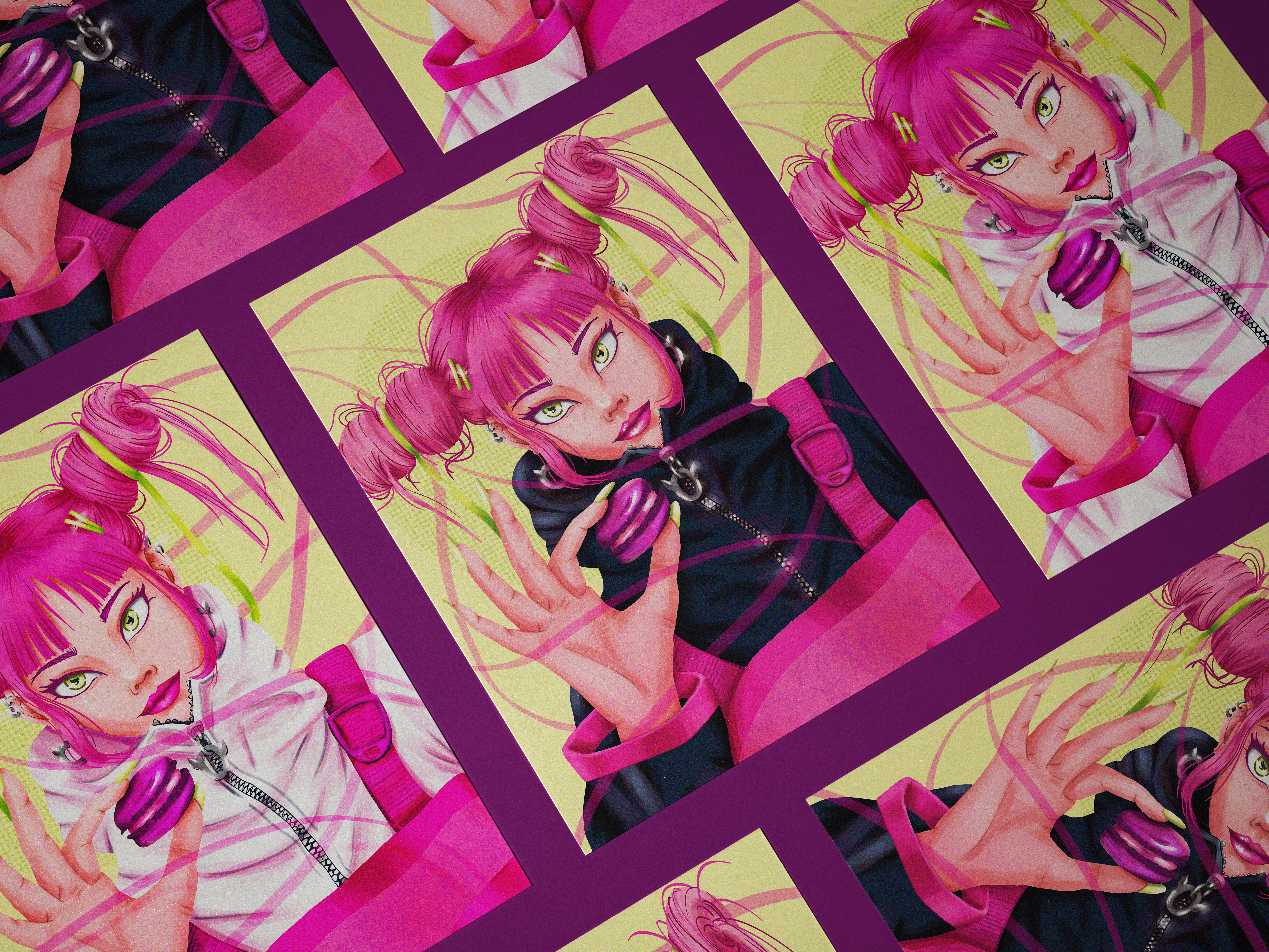
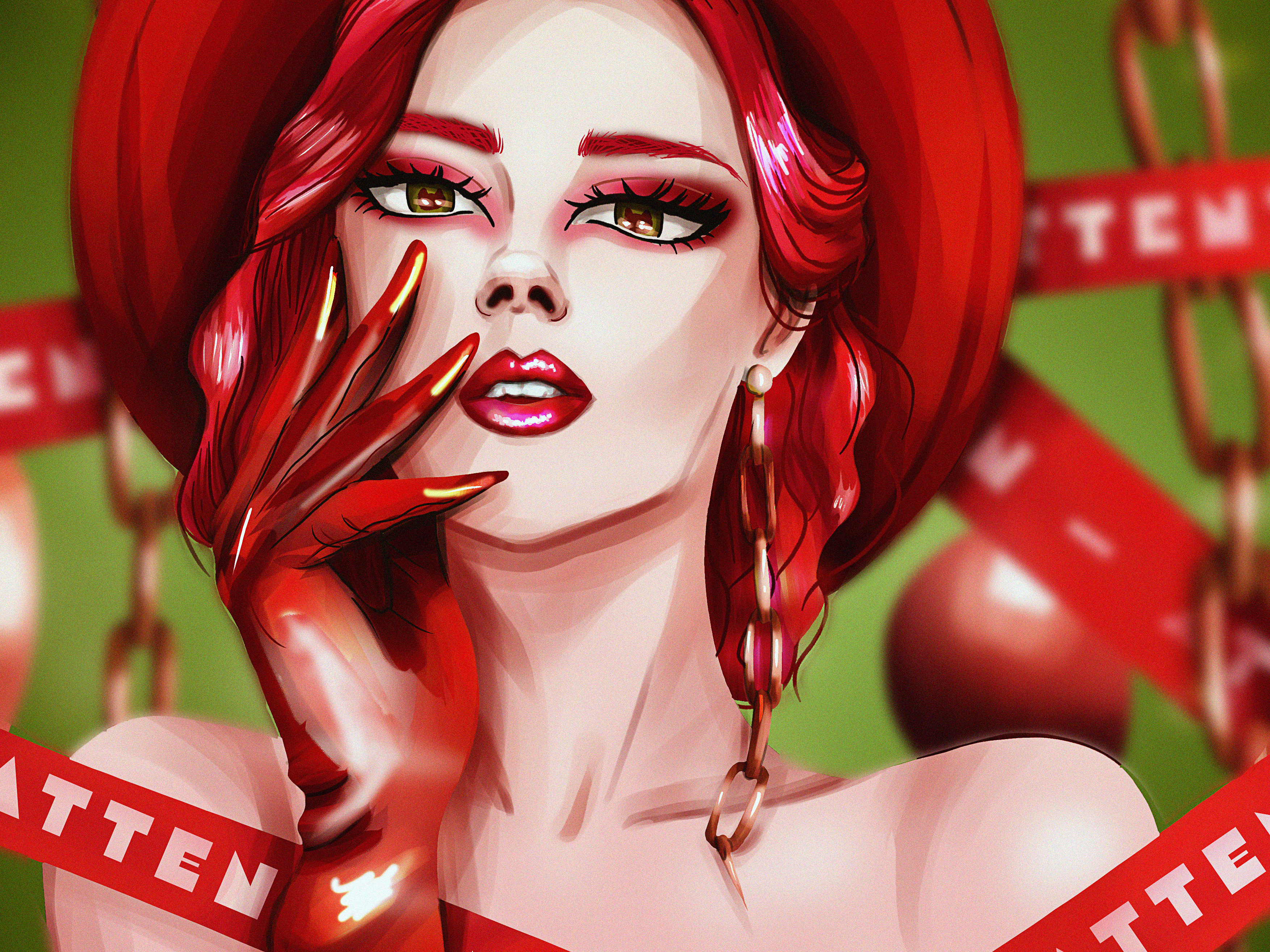
Based on my studies of colours, and inspired by the book "The Designer's Dictionary of Color" by Sean Adams, I've decided to explore the concepts and characteristics of each colour. I've created portraits where the colour palette is primarily composed of the specific colour being studied, extending and stretching the possibilities of use.
Goal: to communicate a specific vibe according to the colour, what the colour makes us feel
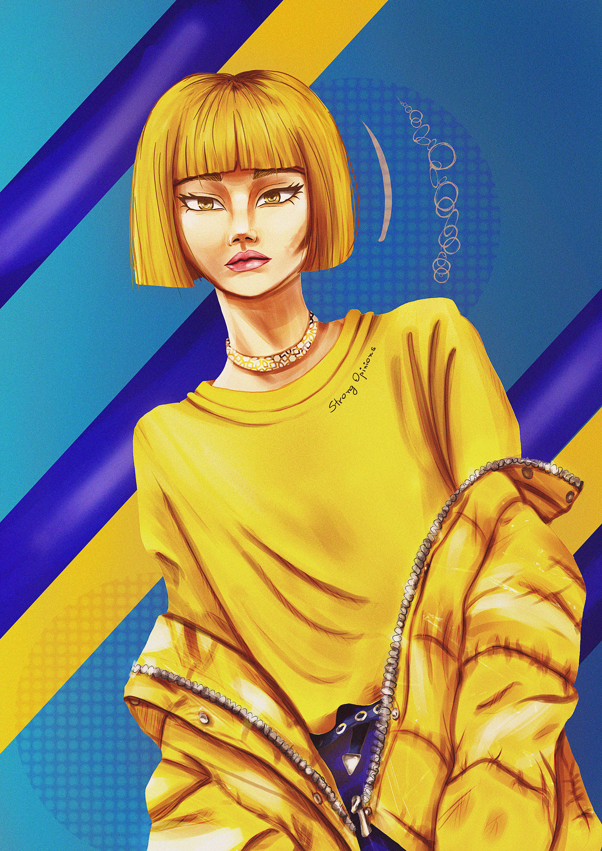
To break the monotony I chose one complementary colour (or close related), part of my choice of style
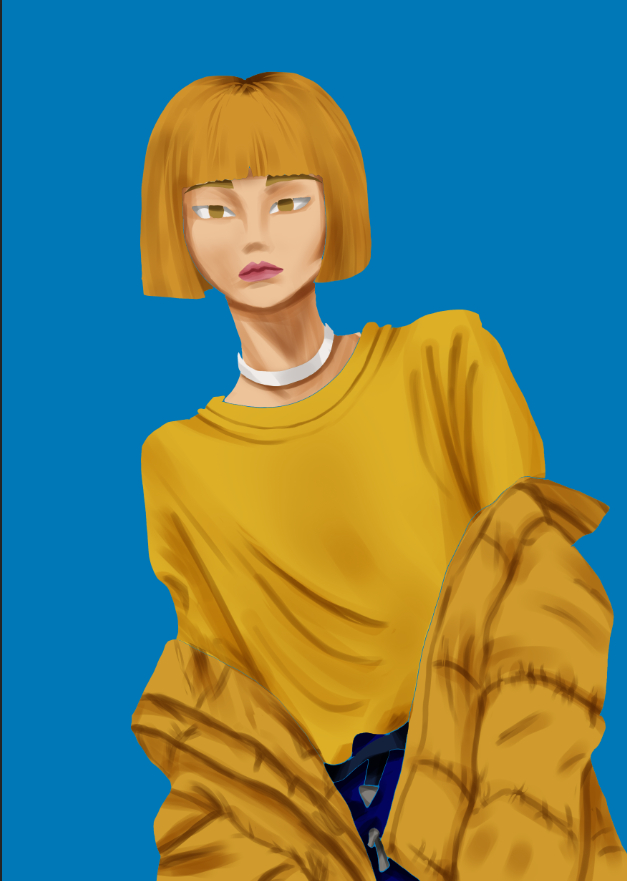
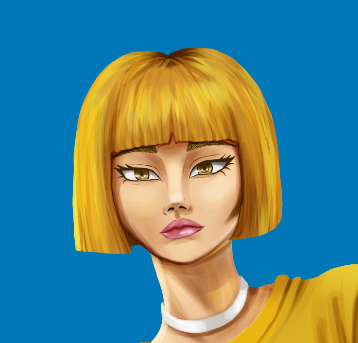
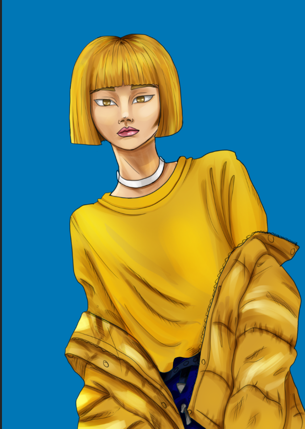
Colour Characteristics: it’s a natural pigment consisted mostly by clay coloured by iron oxides. It’s a combination of yellow, mustard, and brown. Of strong opinion and associated with specific times in history.
Other Names: mustard, sepia, butterscotch, haverst gold, old gold
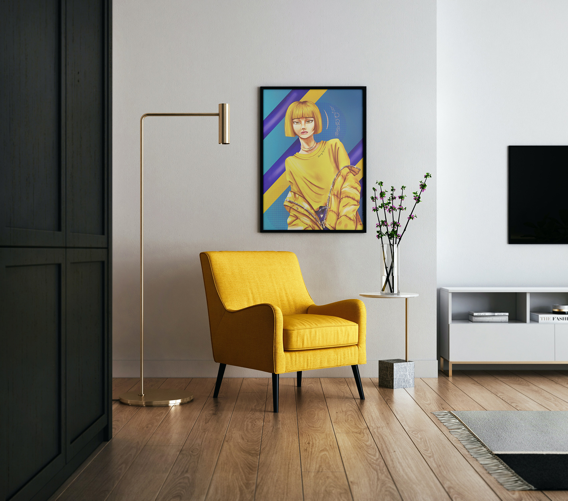
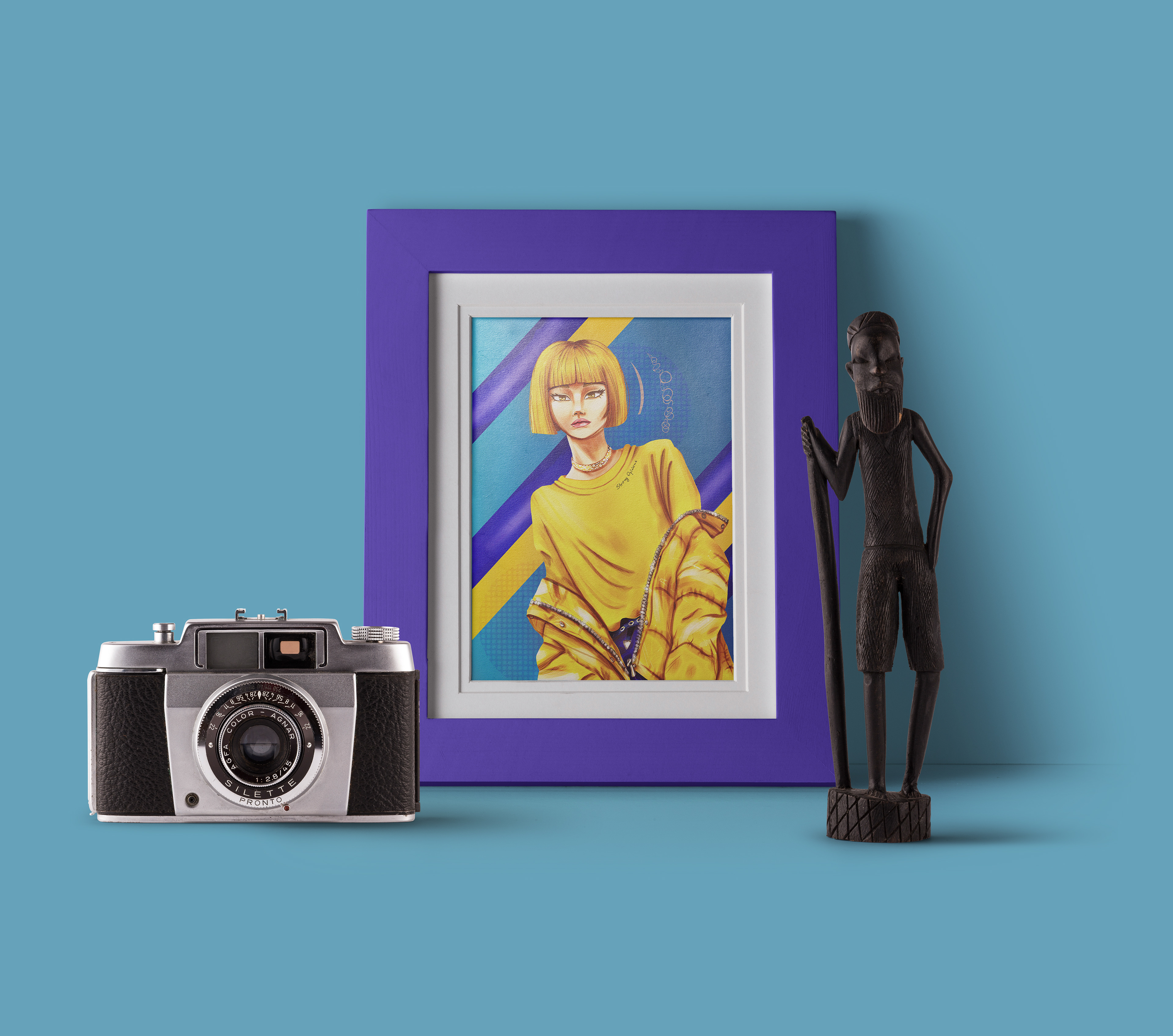
Thank you for watching :)
You can also check other works on my Instagram