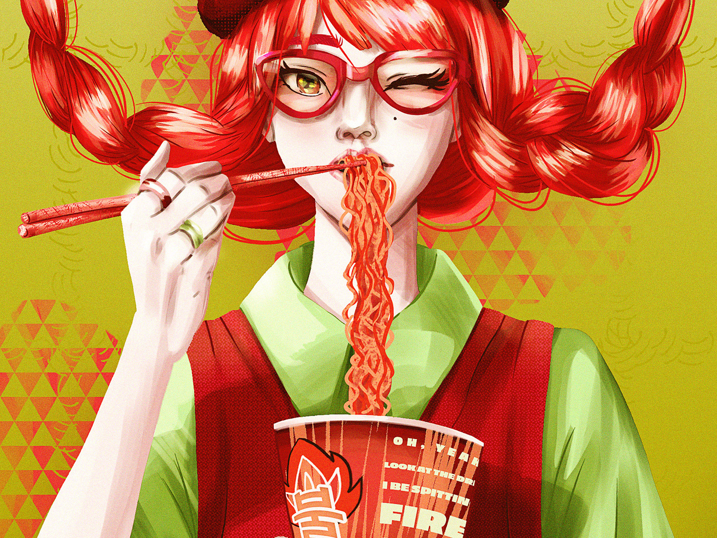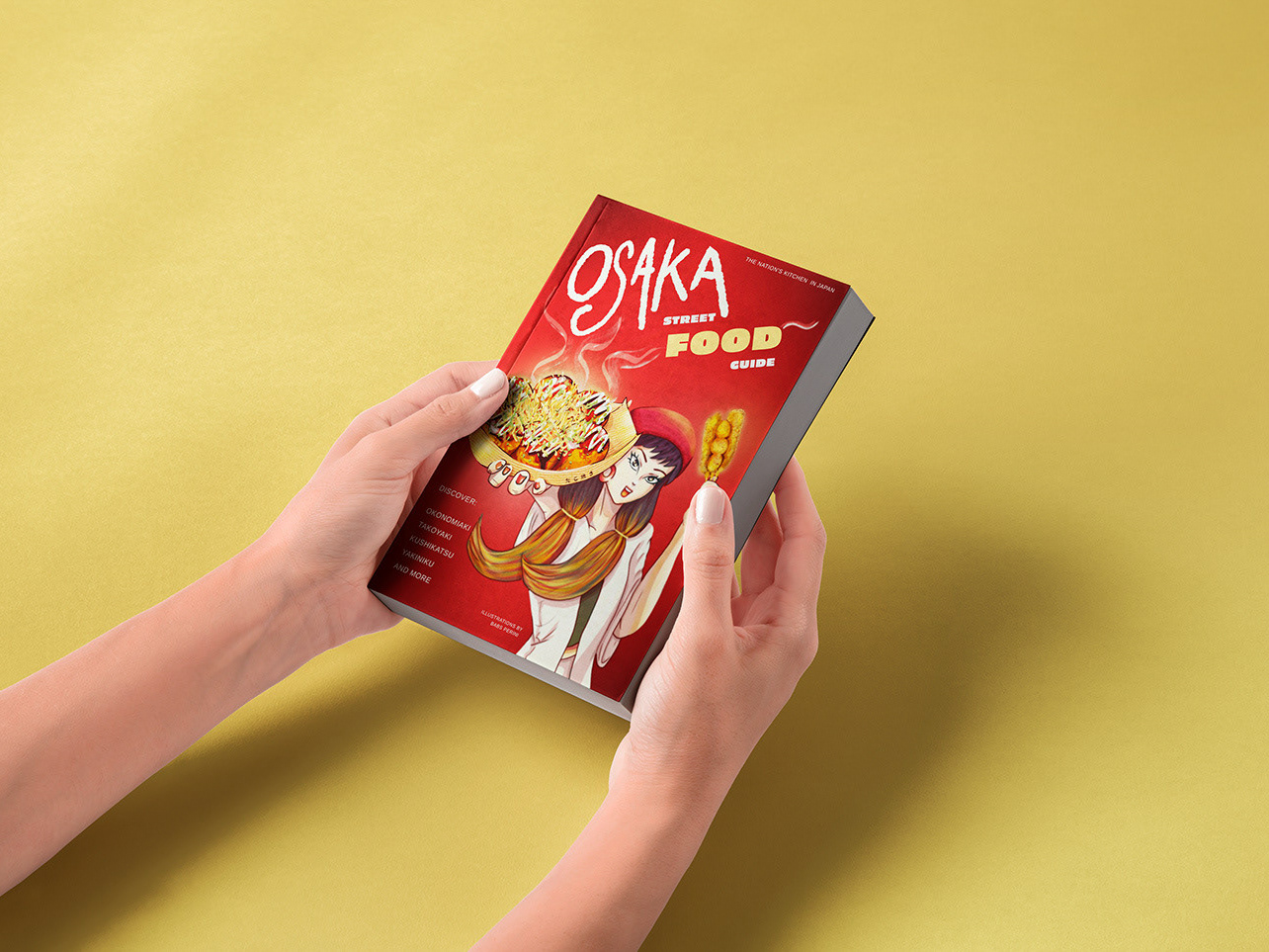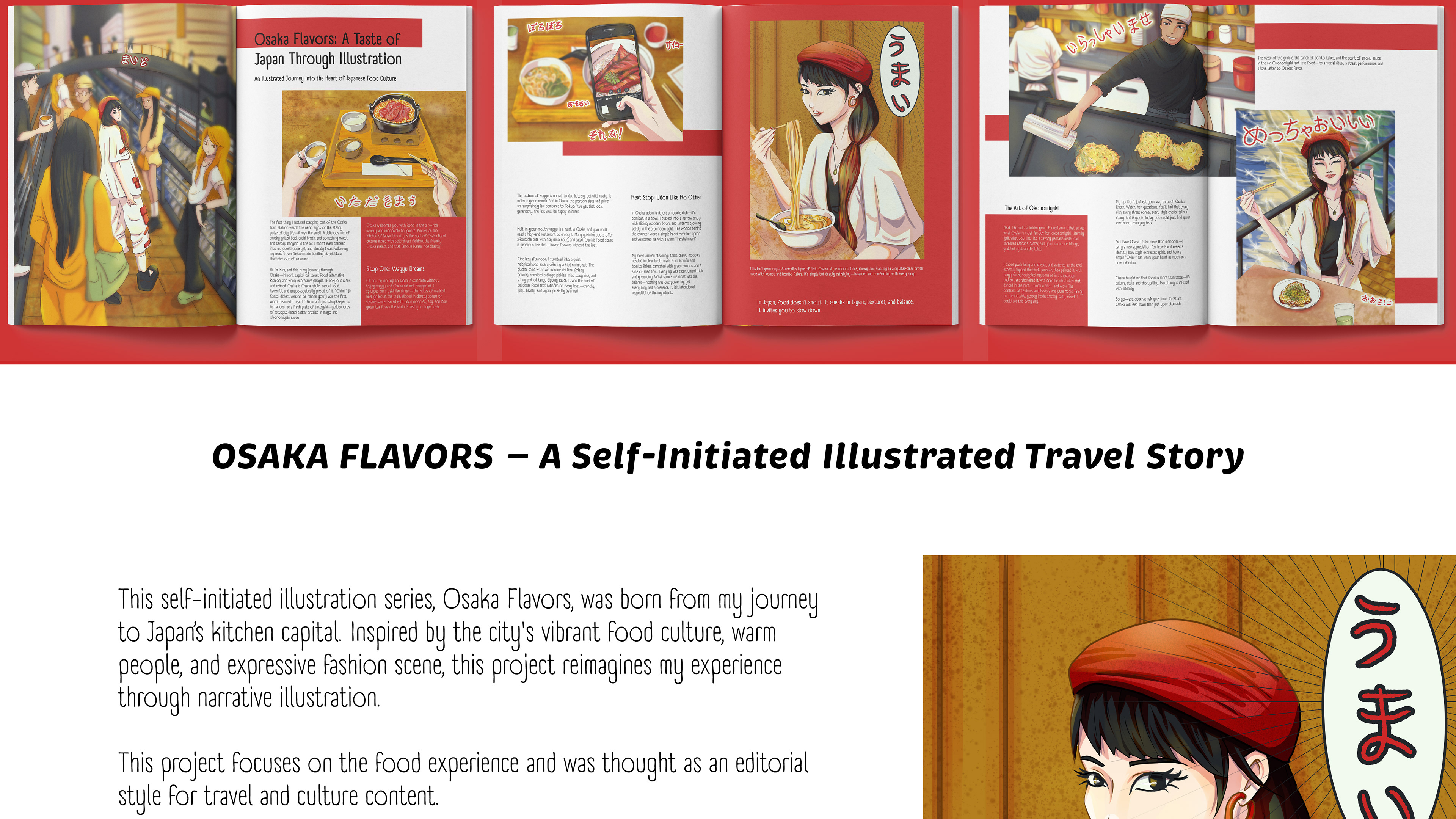
introduction and presentation of the illustration project called Osaka Food Editorial Illustration containing images of magazine mockup displayed on the header and the illustration of the female character wearing red hat and eating noodles in a Japanese restaurant with the thought balloon effect reading the hiragana word for "umai" which means yummy
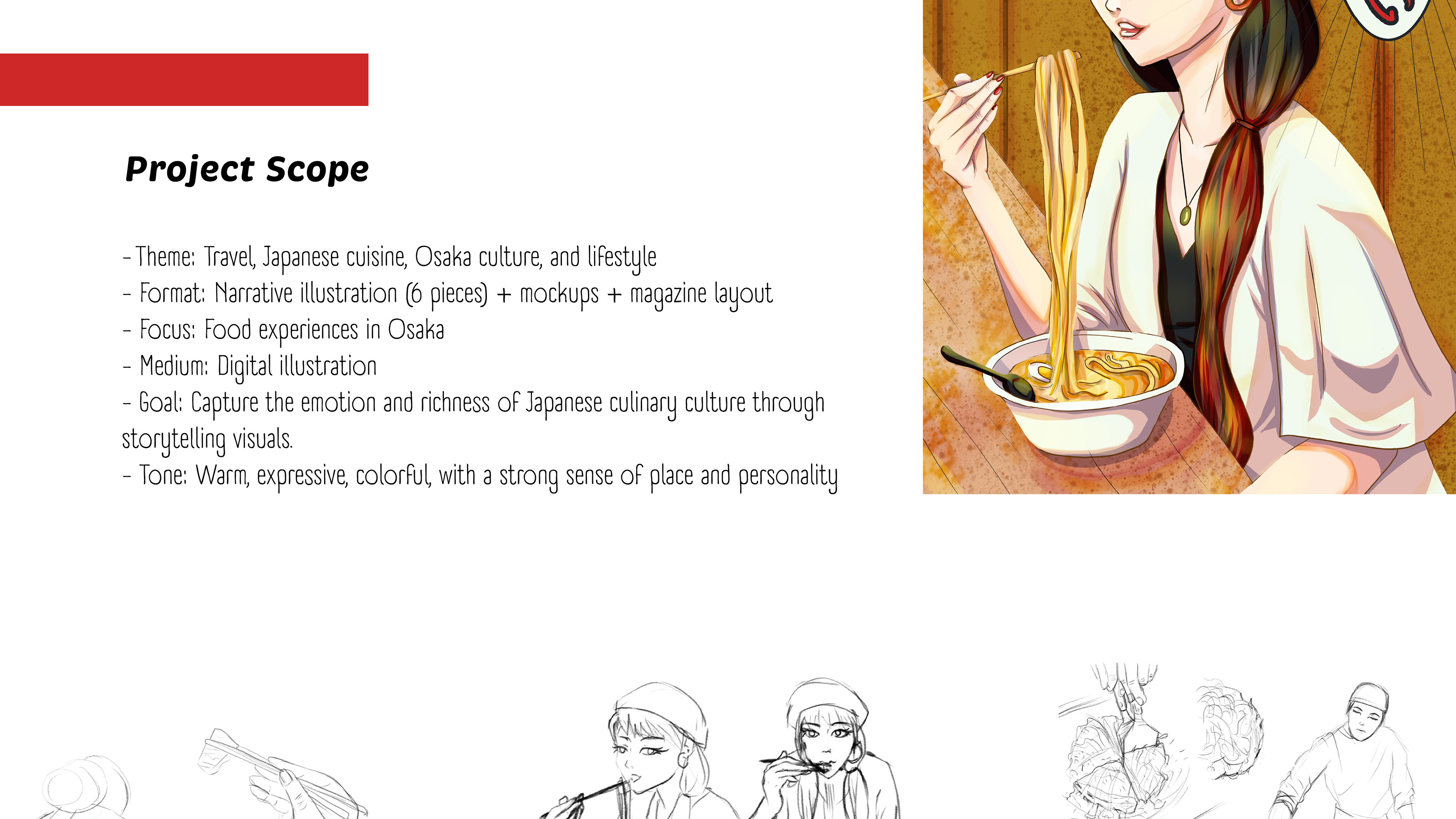
presentation and information of the editorial illustration project scope, Osaka Food Editorial Illustration containing sketches of the process and a coloured version of the female character wearing red hat and eating noodles in a Japanese restaurant with the thought balloon effect reading the hiragana word for "umai" which means yummy
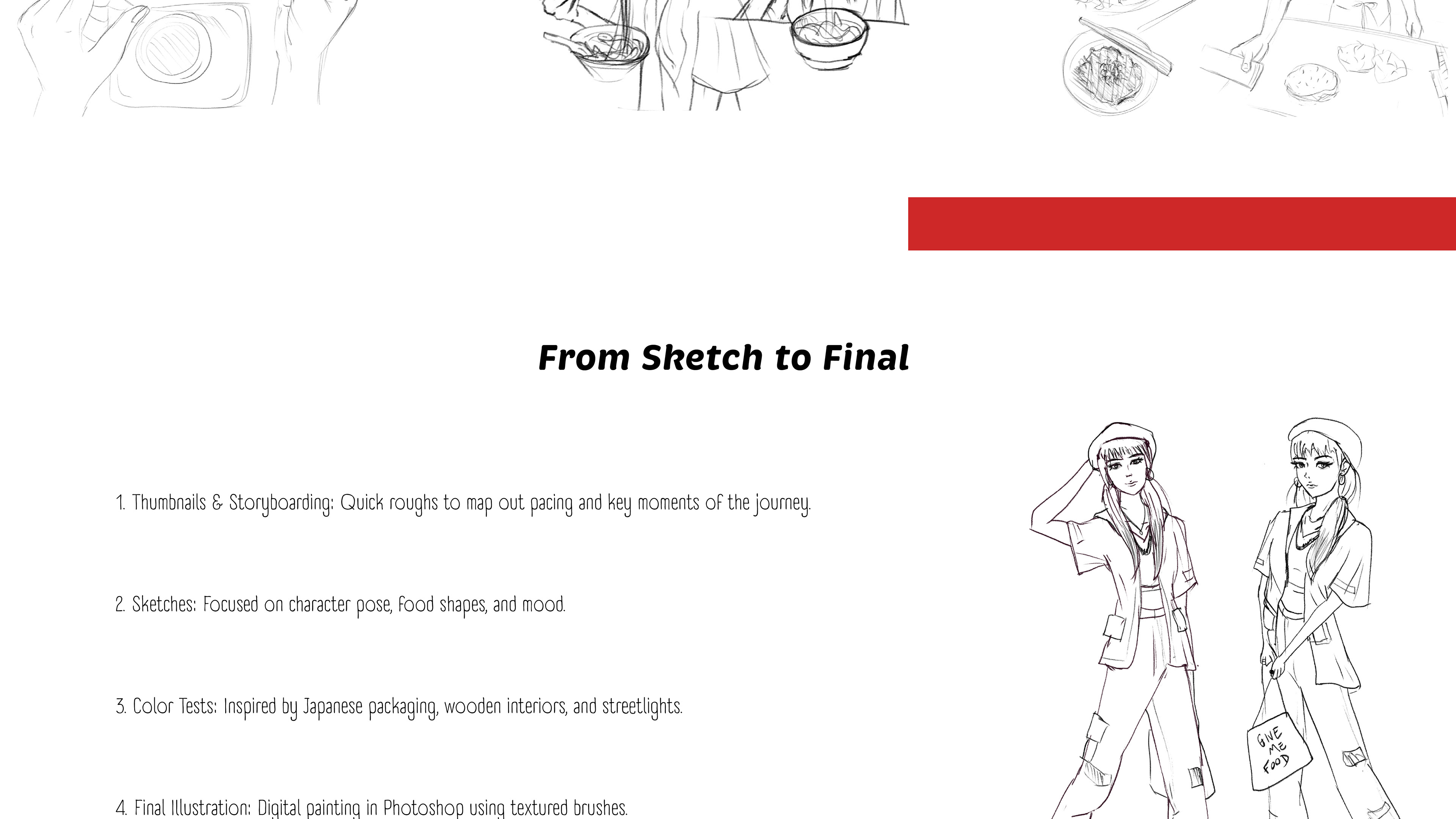
explanation of the sketch process and sketch version of the character design: a girl wearing top, loose shirt, hat, pants, and Japanese style shoes
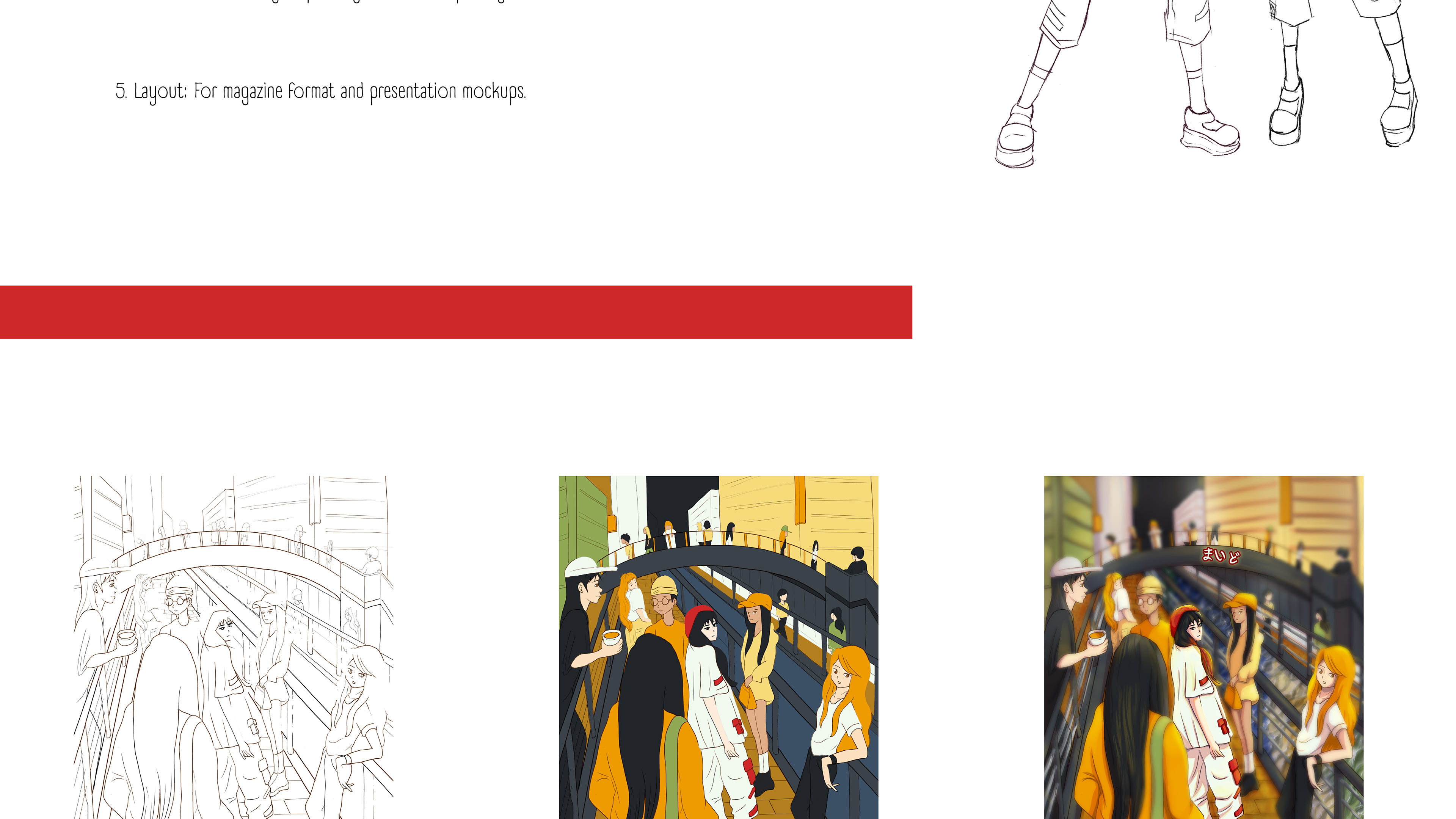
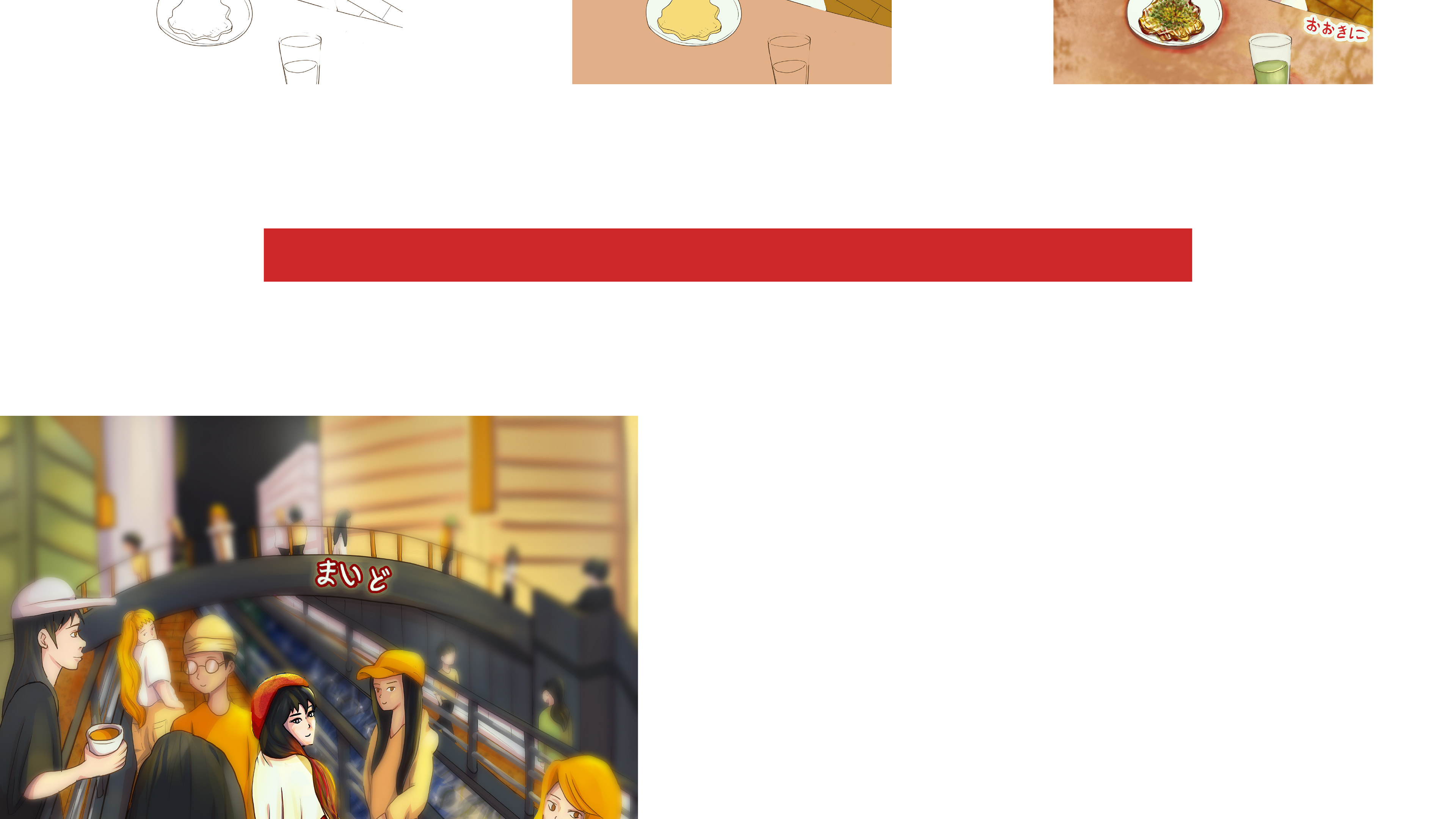
sequence the project process from sketch to flat colour to finished piece displaying the first illustration of the Osaka river, bridge, and nightlife of Osaka, with the character looking at the viewer surronded by other people. The final colours show her outfit in red and white to represent the Japan flag
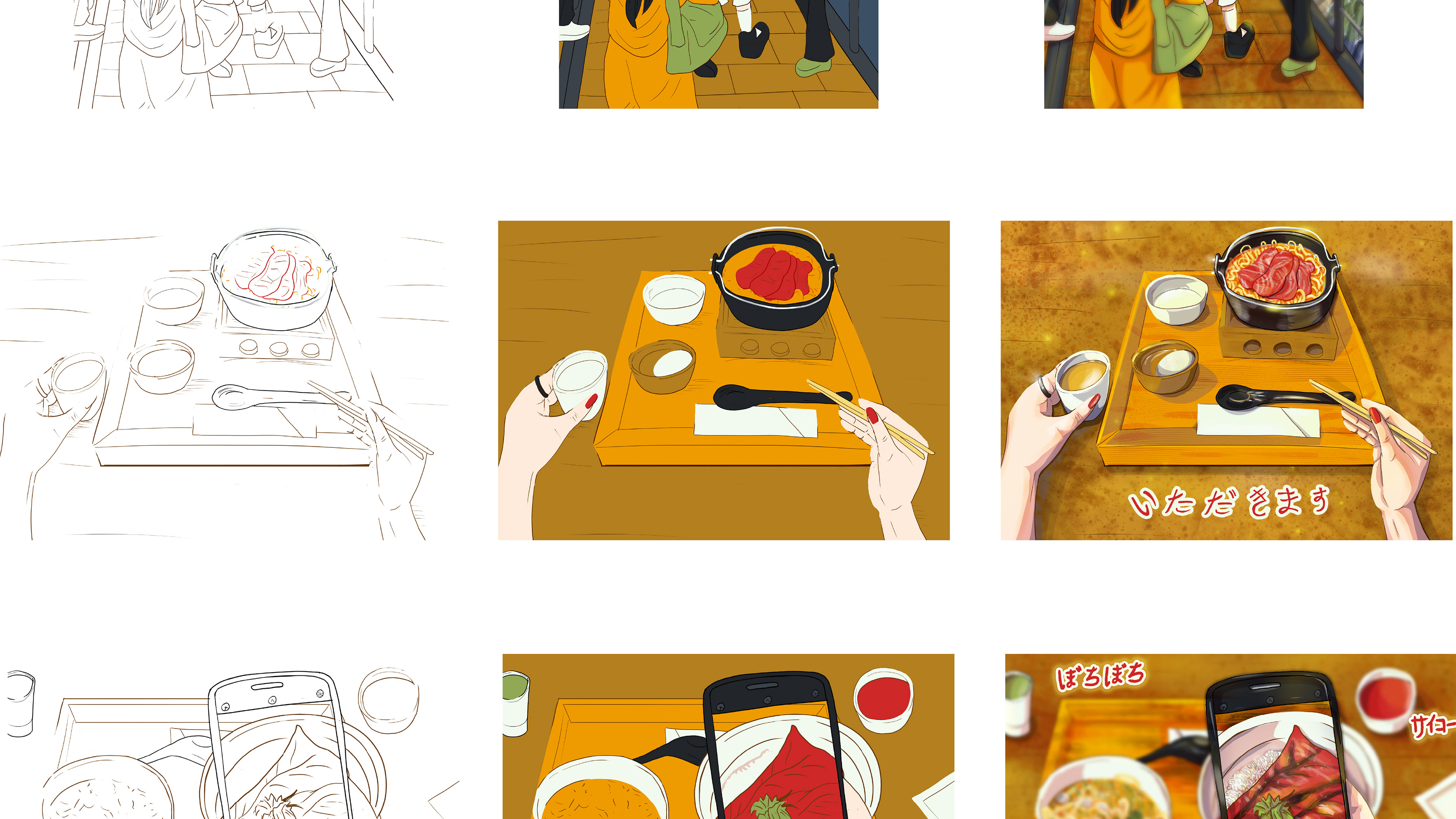
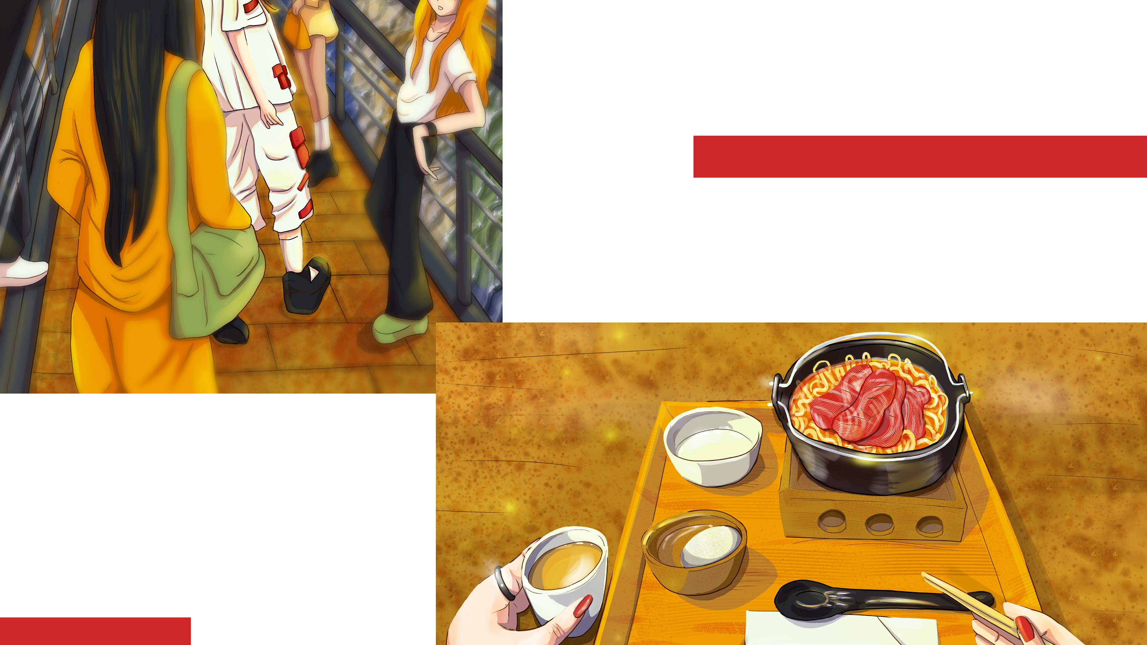
sequence the project process from sketch to flat colour to finished piece displaying the second and third illustrations of the Osaka Food Editorial Illustrations, a table with the food set. The first illlustration shows the wagyu udon in bright red. orange and wood style table. the lettering reads “itadakimasu” which means a way to thank for the food. The second illustration shows another food set, a bowl with fish and rice being photographed by the character. The picture highlights the phone screen and her hand taking the photo while the rest of the table on the background is blurred.
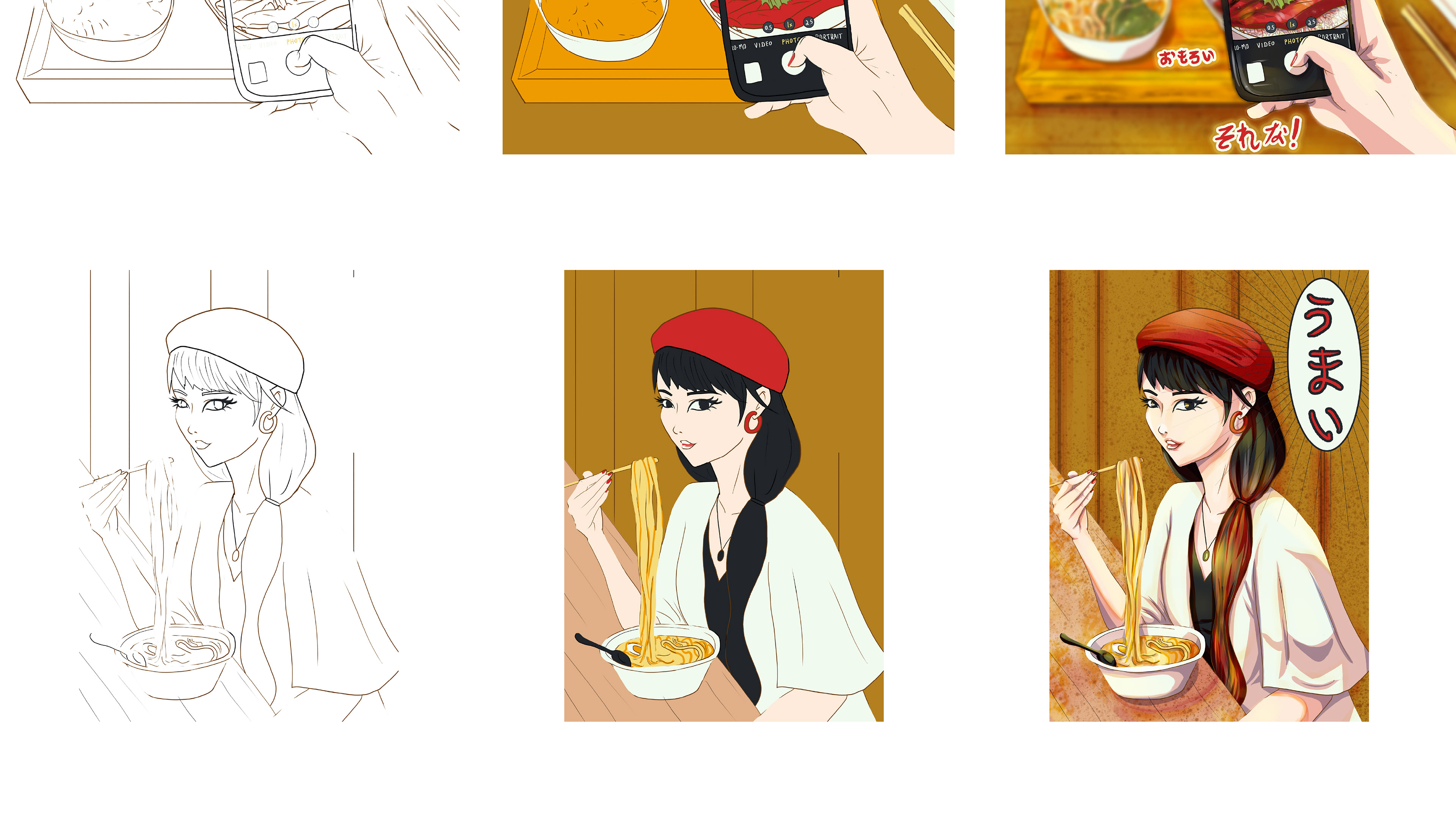
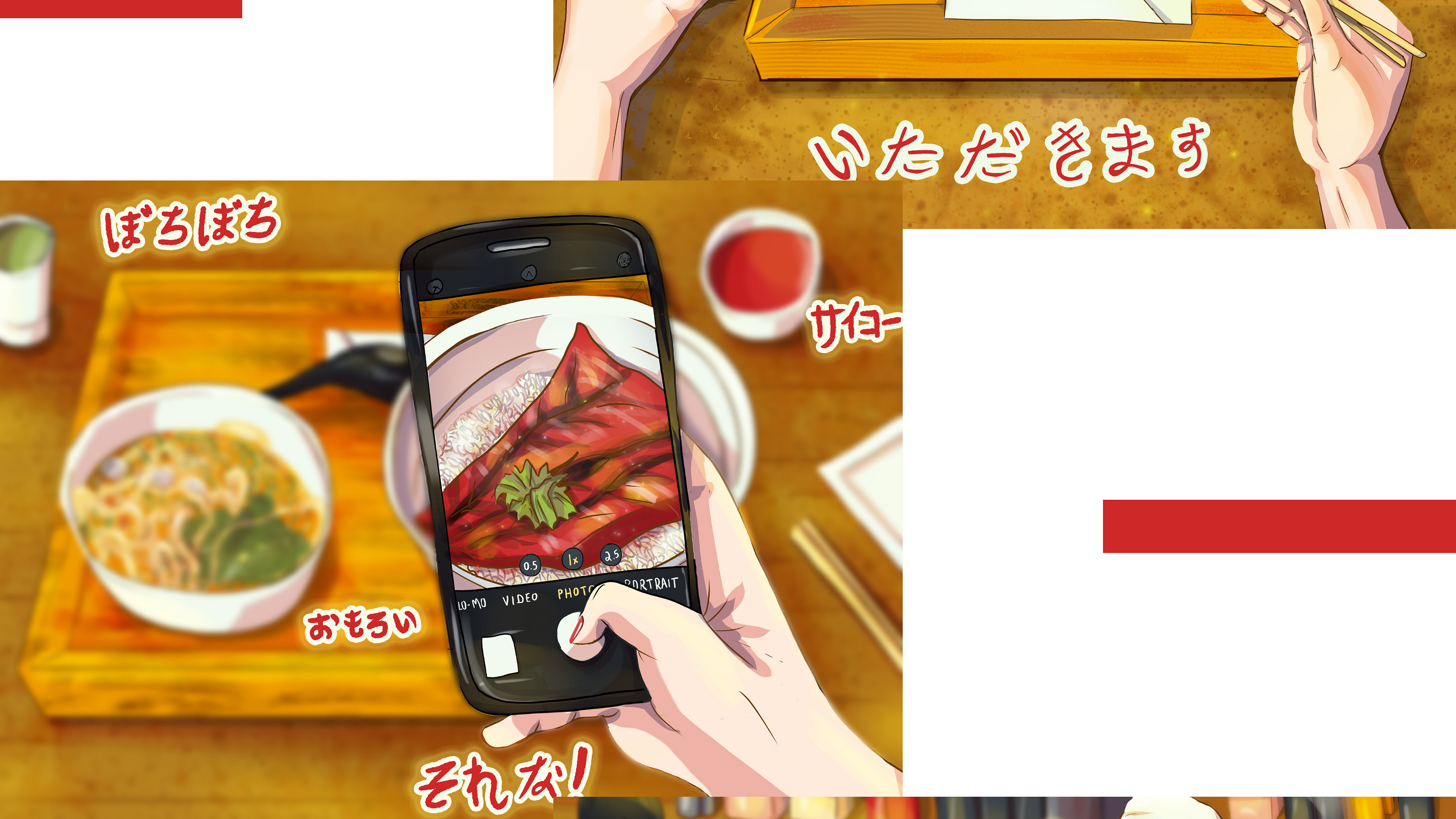
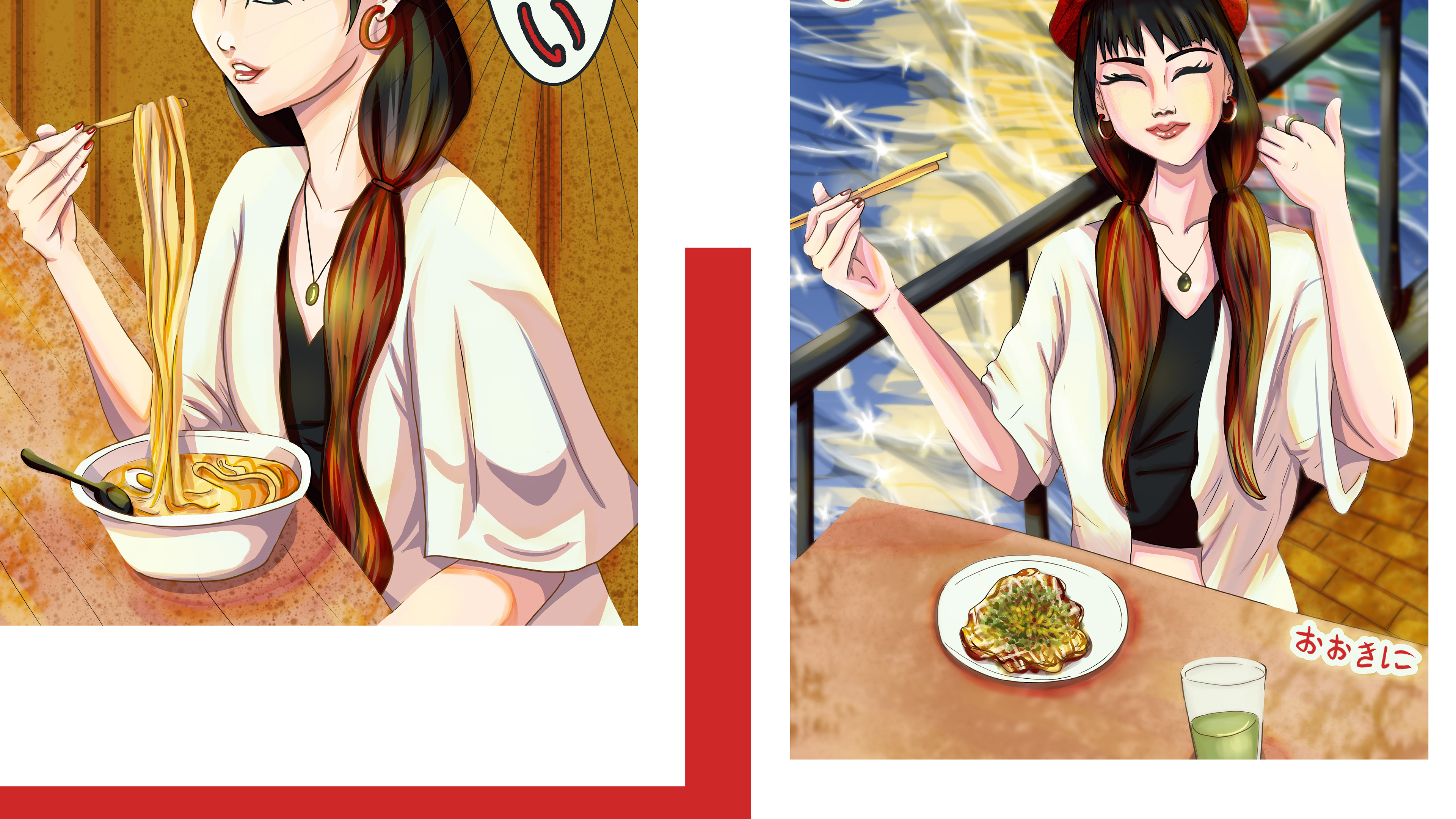
sequence the project process from sketch to flat colour to finished piece displaying the second and third illustrations of the Osaka Food Editorial Illustrations, a table with the food set and the character eating noodles. The first illlustration shows a food set, a bowl with fish and rice being photographed by the character. The picture highlights the phone screen and her hand taking the photo while the rest of the table on the background is blurred. The letterings in hiragana represent “interesting”, “the best”, “that’s it”, and “not bad”. The second illustration contains the girl character wearing a red hat, long hair, wearing a white shirt, and eating noodles with a boiled egg. The background is a wooden space, depicting a traditional Japanese-style restaurant
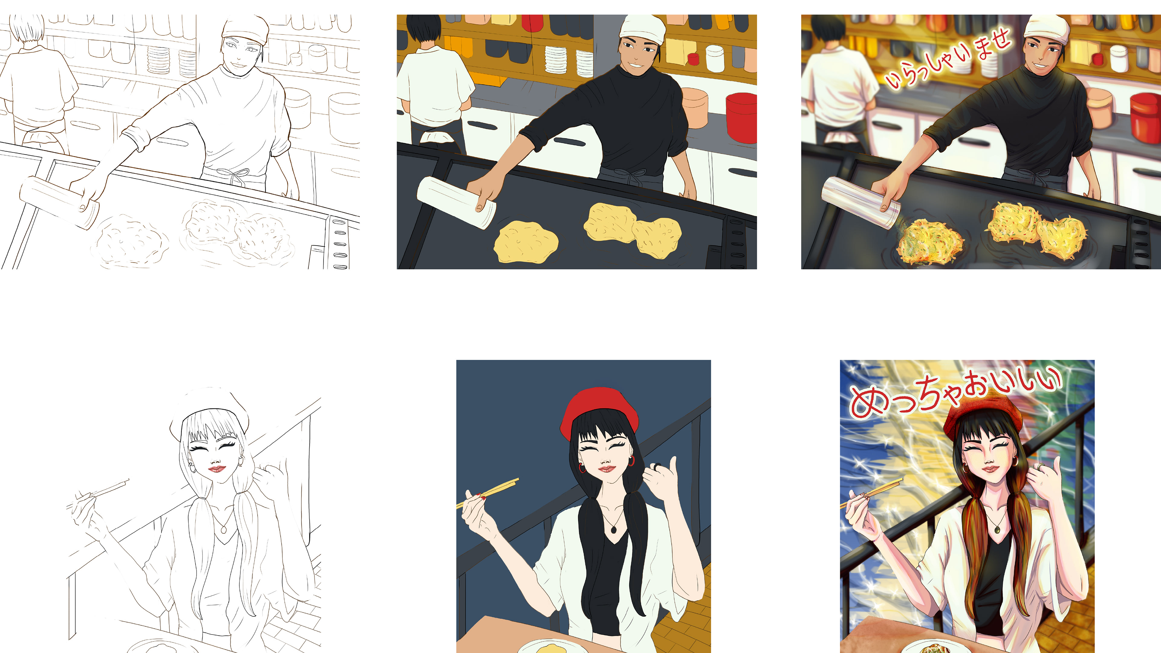
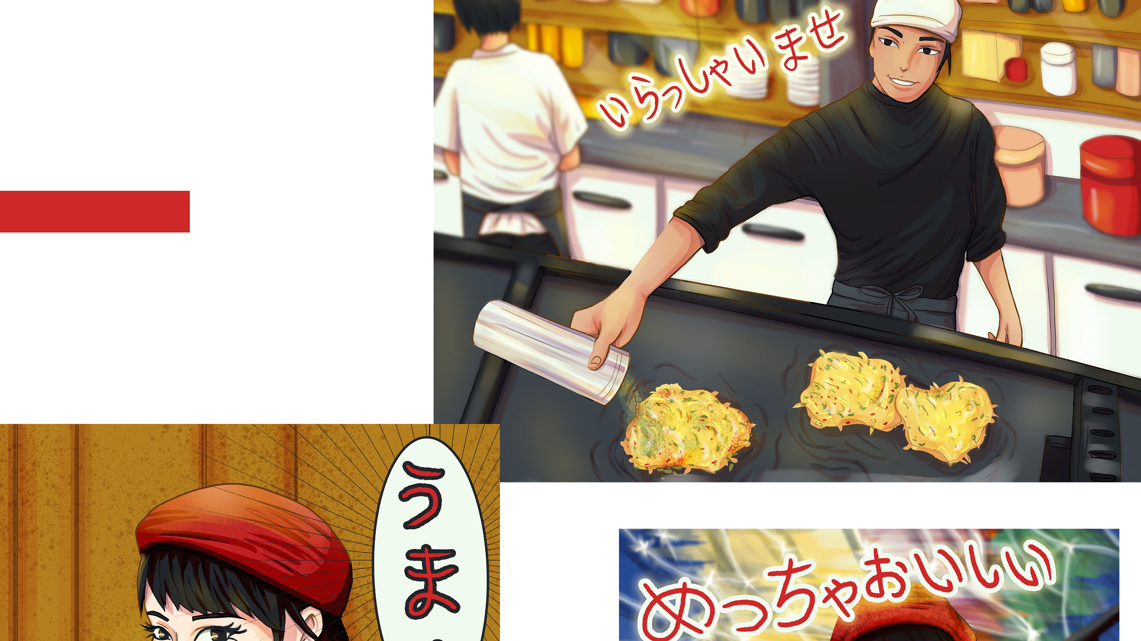
sequence the project process from sketch to flat colour to finished piece displaying two illustrations of the Osaka Food Editorial Illustrations, a typical Japanese chef preparing okonomiyaki and the character smiling and eating the okonomiyaki and signaling thumbs up. The first illlustration shows the Japanese chef at the grill preparing okonomiyaki, a common pancake in Osaka. the image shows the kitchen and an assitant on the background. The second illustration shows the same girl, as the previous images, with a plate of okonomiyaki on the table, a cup of green tea; she’s smiling, thumbs up indicating approval and the letterings displayed on the composition means: “meccha oishii” which means “very delicious” and “ookini” which means “thank you” in the Osaka dialect
final illustrations of the Osaka Food Editorial Illustrations project by Babs Perini shown in a bigger size for more details. Illustration of the river in Osaka. the main colours are yellow, orange and dark gray, highlighting the white and bright outfit of the main character
final illustrations of the Osaka Food Editorial Illustrations project by Babs Perini shown in a bigger size for more details. Illustration of the table food set showing the wagyu udon and one hand holding the cup of green tea while the other hand holds the chopsticks
final illustrations of the Osaka Food Editorial Illustrations project by Babs Perini shown in a bigger size for more details. Illustration of the table food set showing the bowl of rice and fish, a bowl of noodles in the background plus a cup of tea and sauce. The composition of the illustration shows a hand with a phone taking a picture of the food, highlighting the bowl with fish and rice, while the background is blurred to give a sense of depth
final illustrations of the Osaka Food Editorial Illustrations project by Babs Perini shown in a bigger size for more details. Illustration of a male character representing the Japanese chef preparing okonomiyaki, the kitchen in the background with an assitant shown from his back as he’s working, and the Japanese word for "welcome" in outlined lettering
final illustrations of the Osaka Food Editorial Illustrations project by Babs Perini shown in a bigger size for more details. Illustration on the left side show the female character eating the noodles with a boiled egg in a typical wooden Japanese restaurant and the lettering in Japanese that means “yummy”. Illustration of the right side shows the same female character eating okonomiyaki at the river in the background, she smiles and signals thumb up that means she’s enjoying the food
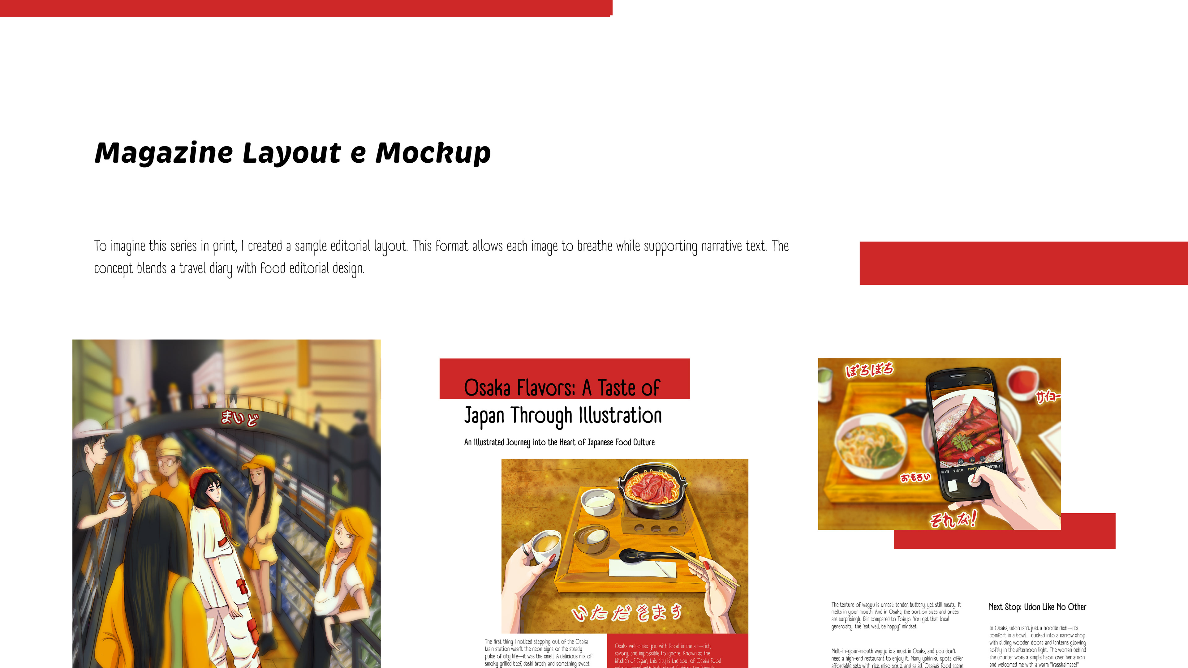
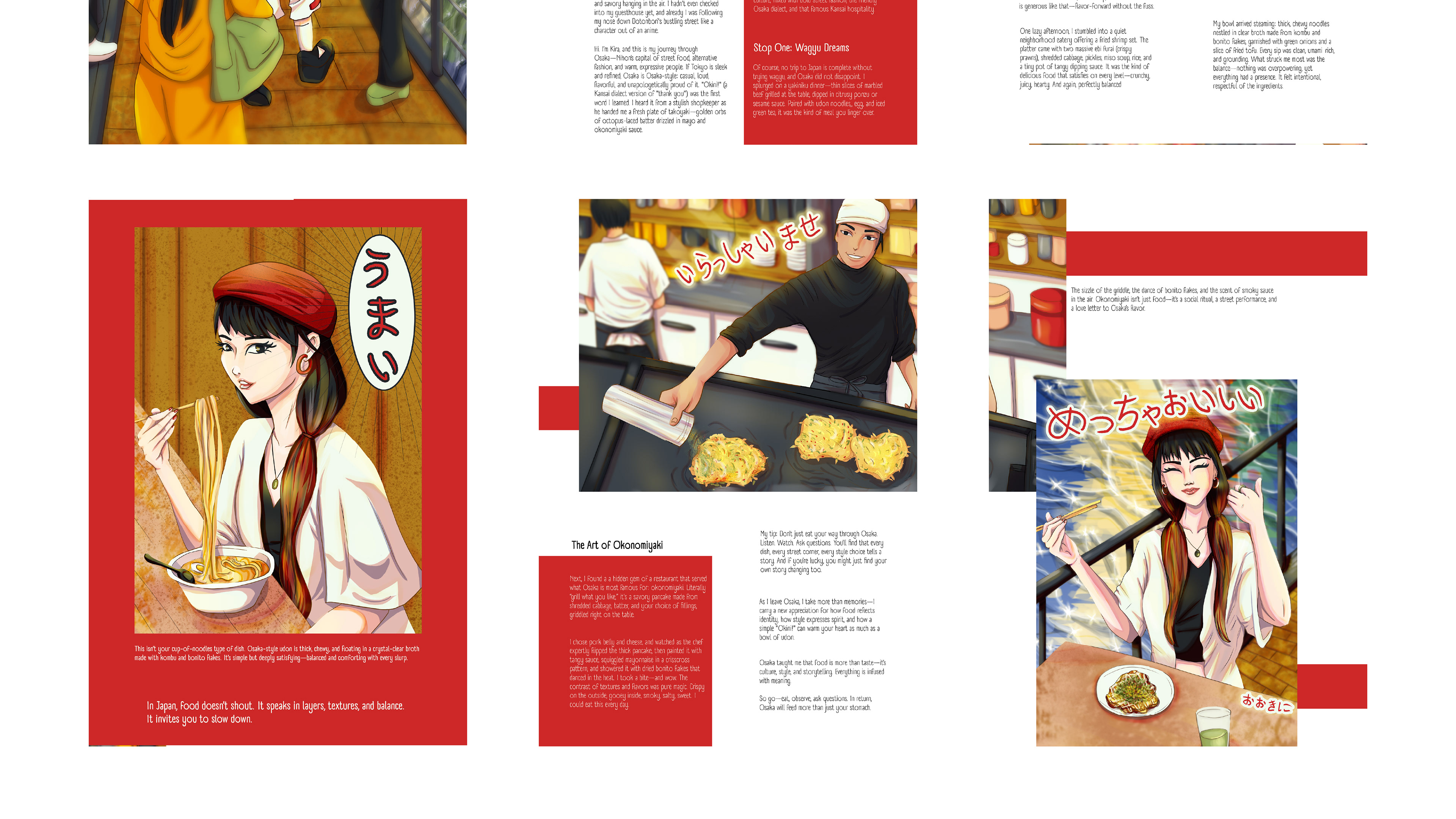
display of the magazine layout and mockup showing the Osaka Food editorial illustration created by Babs Perini. The sequence shows how the illustrations and the article would be disposed on a magazine page. The main colours are red and white, to reinforce the Japanese flag characteristic
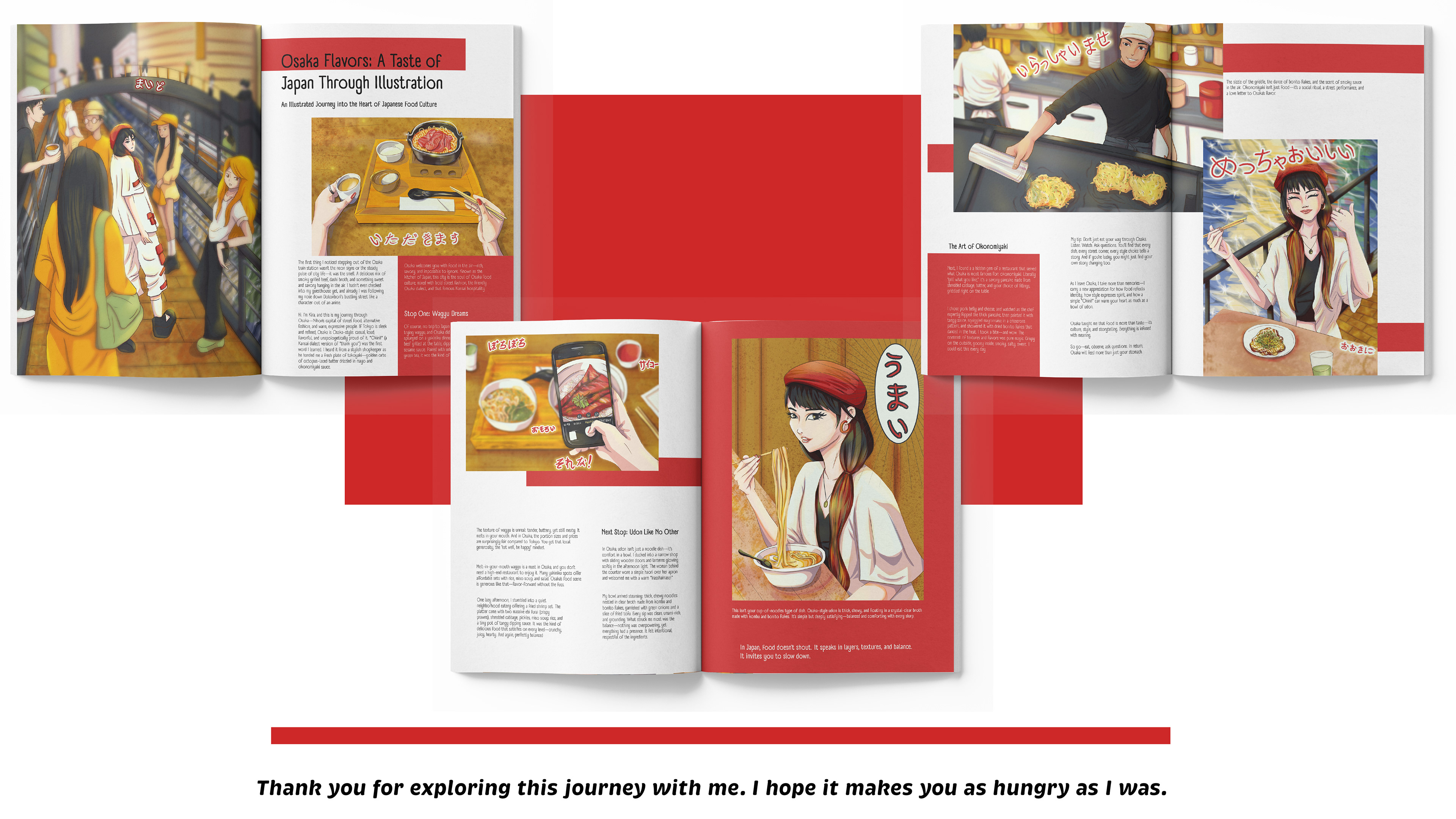
display of the magazine mockup showing the Osaka Food editorial illustration created by Babs Perini. The sequence shows three miniatures of magazine pages and how the illustrations and the article would be disposed on a magazine page. The total are six pages, being the first a full page illustration of the river and nightlife in Osaka. The other pages show a composition of the text content of the article on Osaka Food and the disposition of the other five illustrations along with the article. The main colours are red and white, to reinforce the Japanese flag characteristic
👉 For inquiries, collaborations, or just to say okini, babsperini@gmail.com
You can also check my content on Instagram 😉

You may also like

Back to Top